Marlow Navigation
2026
Captain's Admin: Making captain's daily operations faster
Turning a fragmented, reminder-driven workflow into a single place for captains to understand, prioritise and complete their work.
Overview
Bringing a captain's fragmented workload into one place
A new internal platform that transformed scattered operational responsibilities into a structured, task-oriented experience.
Before the Captains Portal, captains managed operational responsibilities across paper forms, spreadsheets, emails, chats and phone calls.
The challenge wasn't simply to digitise individual processes.
Captains had hundreds of different responsibilities, each with different formats, frequencies, deadlines and dependencies. I needed to design a system that could bring these workflows together without creating a bespoke experience for every new process.
I designed a scalable task-oriented foundation that gives captains a clear view of what needs attention, when it needs to happen, and what action to take next.
Problem
A fragmented workload made everyday operations harder
Managing operational responsibilities was unnecessarily fragmented
Captains managed many different responsibilities through different channels and formats. Information could come from Marlow, vessel owners or seafarers, while some processes relied on the captain manually passing information between people and teams.
This made it difficult to see what needed attention, when it was due, and which steps could be simplified or automated.
It also raised a broader product question: which existing steps were still necessary, and which could be simplified, automated or moved to another user?
Research
The initial problem was only the surface
I spoke with captains, seafarers, operators and internal stakeholders to understand how work moved across the operation.
To analyse the problem properly, I worked at two levels in parallel:
The big picture
I mapped the full operational landscape — the different tasks, users, handoffs, dependencies and systems involved — to understand how everything connected.
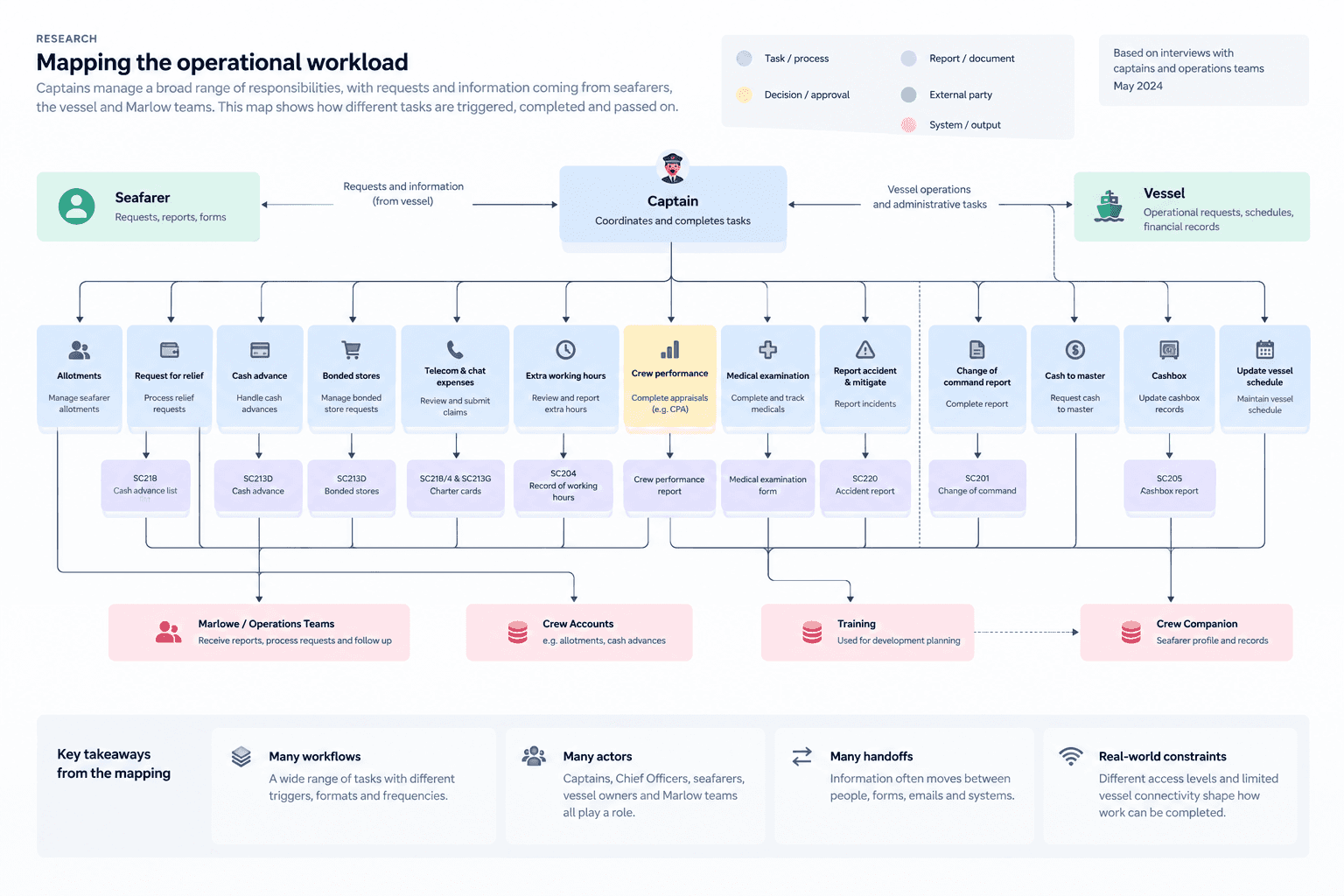
The workflow level
At the same time, I analysed one of the most complex tasks end to end, looking closely at its states, handoffs, exceptions and information needs. This helped me make sure the solution could scale across many workflows without becoming too generic to support the details of each one.
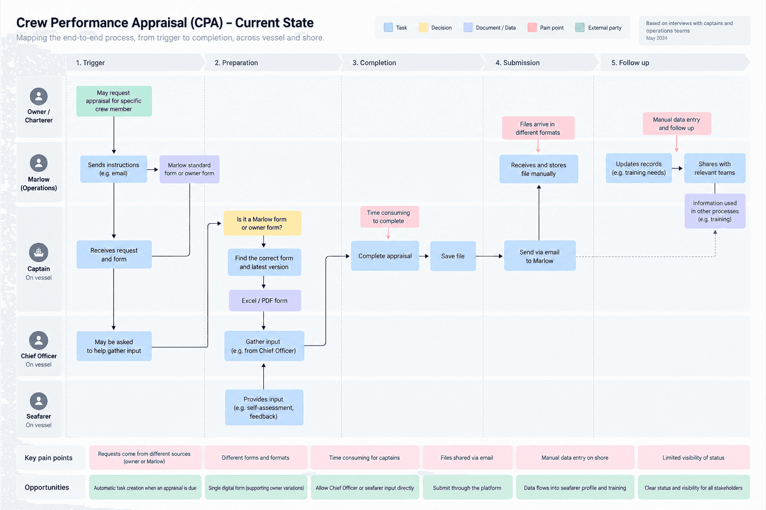
What the mapping revealed
The research uncovered different owners, triggers, frequencies, formats and dependencies across tasks. Some captains delegated work to Chief Officers and mainly acted as approvers, while other processes contained manual handoffs that could be removed or automated.
Limited vessel connectivity also introduced an important technical constraint, meaning the experience had to remain lightweight and efficient.
The research therefore helped us identify both where the workflows could be improved and what needed to remain flexible within the system.
Reframing the challenge
Despite the differences between workflows, one common need emerged: Captains needed a consistent way to understand what required their attention, when it was due, and what action to take next. This became the core design question:
'How might we give captains a consistent, scannable way to understand and complete any operational task, while still supporting the complexity of individual workflows?'
Ideation
Finding a scalable way to organise the workload
Exploring interface directions
Using the workflow maps and research insights, I explored different ways to organise the captain’s workload. The goal was to find a model that was quick to scan, flexible across different workflows, and scalable as new task types were added.
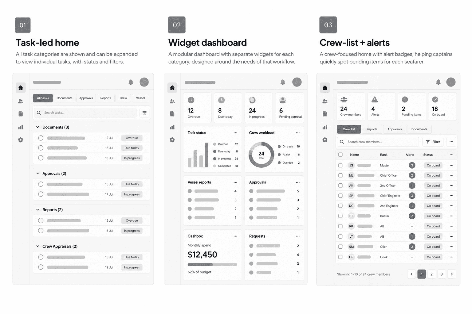
I compared three directions:
Task-led home
All task categories and their items are visible in one place. This made the workload easy to scan, but could become cluttered or inconsistent as categories grew and task structures varied.
Widget dashboard
Each category had its own modular widget. This was the most scalable direction because each workflow could evolve independently, but it was less uniform and made it harder to understand everything due within a specific timeframe.
Crew-list + alerts
A crew-focused home surfaced pending items against individual seafarers, with reports and other work accessible separately. This worked well for crew-related responsibilities, but did not provide a complete view of the captain’s overall workload.
Choosing the direction
Through rapid iteration, prototyping, and comparison to best-in-class experiences, the direction became increasingly clear.
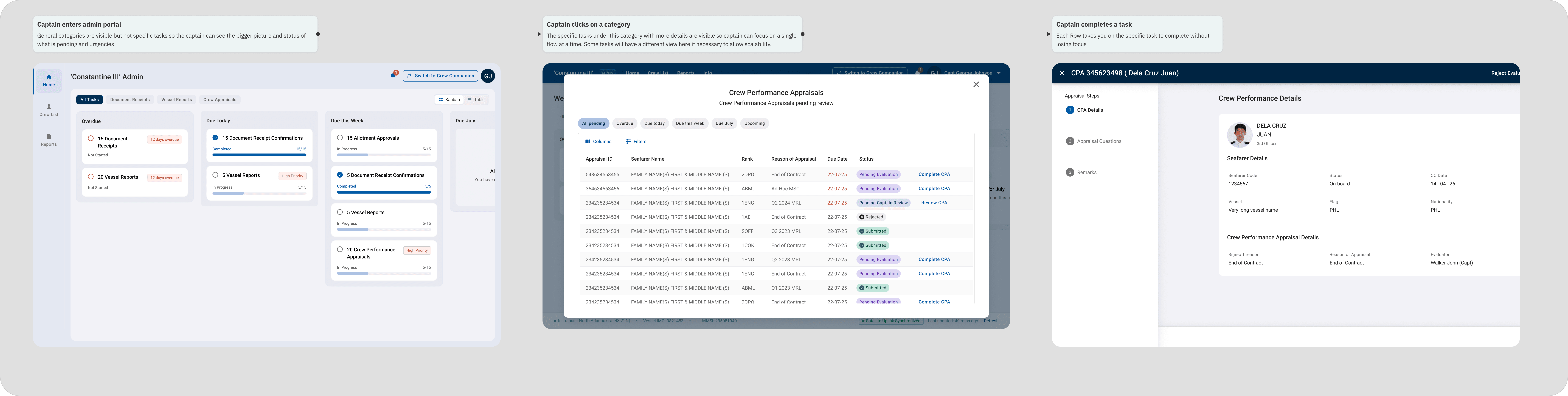
The final direction combined the strongest parts of the first two approaches: clear task categories with time-based prioritisation, giving captains a consistent overview of what needs attention while keeping the system flexible enough to support different workflows.
The core structure, visual tone, and interaction model were already forming before any final screens were produced — the rest of the process was about refining, validating, and shaping that vision into something cohesive and scalable.
Designs
Turning the concept into a development-ready system
Once the direction was defined, I worked closely with engineering to turn the concept into a solution that was not only usable, but also realistic to build and efficient to run onboard vessels.
Designing for limited connectivity
Internet onboard could be slow and unreliable, so performance became part of the UX.
I reviewed what information genuinely needed to load and removed non-essential elements such as profile pictures, maps and other heavy visual content. I also worked with backend engineers on when data should load so the most important information could appear first.
The goal was to keep the product lightweight without compromising the captain’s ability to complete the task.
Simplifying the UI without increasing implementation cost
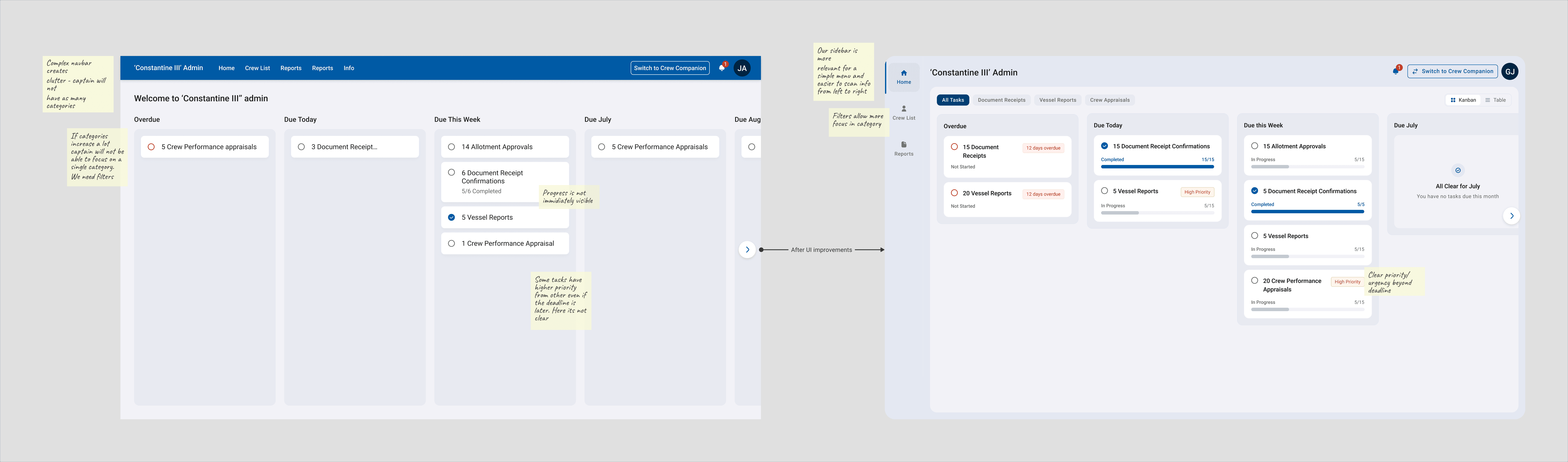
Our existing back-office products were visually dense and contained many customised patterns. For the Captains Portal, I wanted the interface to feel simpler and easier to scan, especially for users working under time pressure.
Rather than introducing a completely separate UI system, I adapted the Argo Design System to support a lighter visual language using reusable patterns and existing technical foundations.
This allowed the experience to feel simpler while remaining consistent, scalable and practical for engineering to implement.
Defining the interaction details
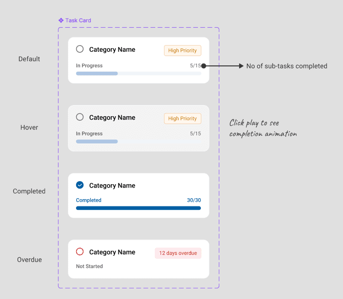
I then took the designs beyond static screens and specified how the product should behave.
I defined states, transitions, feedback and micro-interactions so engineers could understand what should happen before, during and after each action, rather than having to infer behaviour from the UI.
This included documenting how task states, priority, progress and completion should behave across the experience.
Preparing for development handoff
The final handoff included the complete user flows, reusable components, responsive behaviour, edge cases and interaction logic needed for implementation.
By this stage, the design was not just a set of screens — it was a defined product system, with the behaviour and constraints documented clearly enough for engineering to build consistently.
One structure, different workflows
The same task model could then support approvals, reports, appraisals and confirmations while allowing each workflow to retain the interactions it needed.
That balance between a consistent task structure and flexible workflow behaviour became the foundation for scaling the portal as new responsibilities were added.
Implementation & Adoption
Turning the design into a working product
I worked closely with Product and Engineering to move the Captains Portal from final design into development, balancing the intended experience with technical constraints onboard vessels.
I prepared development-ready flows, component states, interaction specifications and edge cases, supported engineers throughout implementation, and reviewed the product during QA to make sure the final experience matched the intended behaviour.
Building for adoption and scale
The portal introduced a common task model that could be reused as additional operational workflows were brought into the product. This allowed new functionality to be added within an established structure rather than designing each workflow independently.
The result was a more consistent and scalable operational experience, giving captains clearer visibility of their workload while reducing manual coordination and data handling for operations teams.
Early impact
For the Crew Performance Appraisal workflow, a modelled comparison estimated:
Captain: ~14 min → ~5.5 min per appraisal
Operator: ~10 min → ~5 min per appraisal
Combined operational time: ~24 min → ~10.5 min per appraisal
That represents an estimated ~56% reduction in total operational time per appraisal, while operator handling time alone was reduced by 50%.
Beyond individual task efficiency, the broader impact was moving operational work from emails, spreadsheets and manual handoffs towards structured, connected workflows.
CPA timings are modelled estimates with product team and stakeholders rather than measured product KPIs.

